R Image Art
I recently showed my students an image-art project that I had worked on using D3.js, and on of them asked,
Can you do that with R?
So, I figured it was worth a try. This tutorial walks through the R code necessary to use random sampling to generate data art from image files in R. Read on, or check out the code on GitHub.
Loading Images
In order to do image manipulation in R, you’ll (of course), need to load an image into your environment. I found that the imagr package was well suited for this type of loading (and other types of image processing – see the documentation for more information):
# Load an image into R (make sure your working directory is set!)

# Packages (for the entire project)
library(imager)    # image loading and processing
library(dplyr)     # data manipulation
library(ggplot2)   # data visualization
library(tidyr)     # data wrangling
library(ggvoronoi) # visualization

# Load an image into R
img <- load.image(file = "imgs/spain-graffiti-cropped.jpg")

# Print the image object out
print(img)
## Image. Width: 936 pix Height: 914 pix Depth: 1 Colour channels: 3To view the image itself, you can use the plot() function (this image was downloaded from pixabay):
# View the image
plot(img)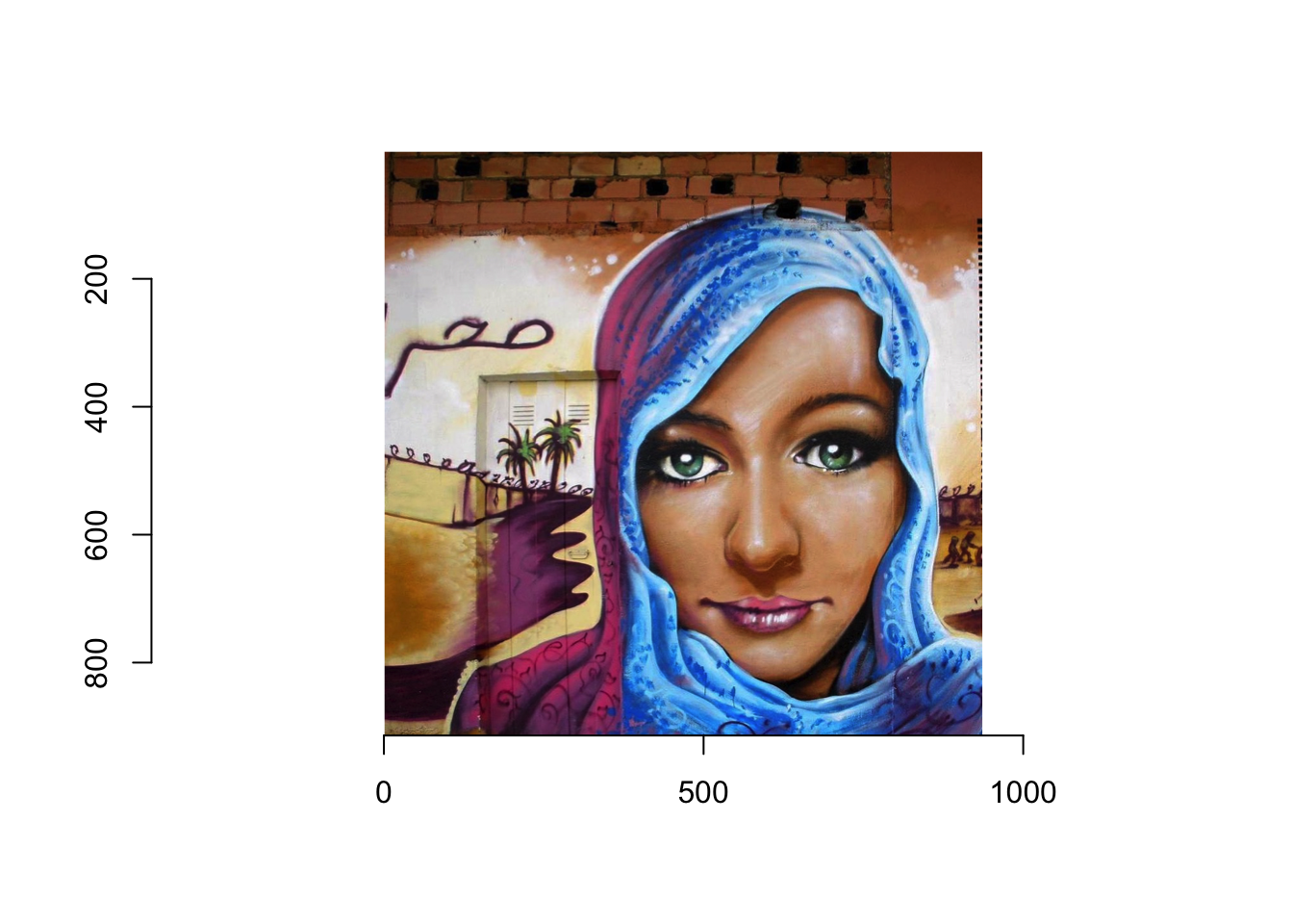
In order to manipulate this image in a data-driven way, we’ll need to represent it as a data frame. Luckily, we can do this using the as.data.frame() method to accomplish this:
# Represent the image as a data frame
img_df <- as.data.frame(img)

# Show a table of the first 10 rows of the data frame
img_df %>%
  arrange(x, y, cc) %>% # sort by columns for viewing
  filter(row_number() < 10) %>% # Select top 10 columns
  kable("html") %>%  # Display table in R Markdown
kable_styling(full_width = F) # Don't take up full width| x | y | cc | value |
|---|---|---|---|
| 1 | 1 | 1 | 0.3803922 |
| 1 | 1 | 2 | 0.1450980 |
| 1 | 1 | 3 | 0.0431373 |
| 1 | 2 | 1 | 0.3607843 |
| 1 | 2 | 2 | 0.1254902 |
| 1 | 2 | 3 | 0.0235294 |
| 1 | 3 | 1 | 0.3803922 |
| 1 | 3 | 2 | 0.1450980 |
| 1 | 3 | 3 | 0.0431373 |
These four columns describe how to draw the image:
x: The horizontal position of a point (pixel) of the imagey: The vertical position of a point (pixel) of the imagecc: The color channel being represented: 1 (red), 2 (green), 3 (blue)value: The value of the color channel, on a scale from 0 to 1.
Thus, the first three rows describe the color of the point in the top left corner of the image. Using the rbg function, this color is rgb(0.788, 0.537, 0.294), which is this color.
Image Data Manipulation
In order to draw the image more easily using familiar graphing packages (such as ggplot2), we’ll need to reshape this data frame so that each row represents a single pixel. This can be done using the helpful spread() function from the tidyr package:
# Add more expressive labels to the colors
img_df <- img_df %>%
  mutate(channel = case_when(
    cc == 1 ~ "Red",
    cc == 2 ~ "Green",
    cc == 3 ~ "Blue"
  ))

# Reshape the data frame so that each row is a point
img_wide <- img_df %>%
  select(x, y, channel, value) %>%
  spread(key = channel, value = value) %>%
  mutate(
    color = rgb(Red, Green, Blue)
  )
Using the rgb() function above, we’re able to compute the color for each point by combining the specified amounts of Red, Green, and Blue (resulting in this data frame):
| x | y | Blue | Green | Red | color |
|---|---|---|---|---|---|
| 1 | 1 | 0.0431373 | 0.1450980 | 0.3803922 | #61250B |
| 1 | 2 | 0.0235294 | 0.1254902 | 0.3607843 | #5C2006 |
| 1 | 3 | 0.0431373 | 0.1450980 | 0.3803922 | #61250B |
| 1 | 4 | 0.0509804 | 0.1450980 | 0.3803922 | #61250D |
| 1 | 5 | 0.0470588 | 0.1411765 | 0.3686275 | #5E240C |
| 1 | 6 | 0.0705882 | 0.1568627 | 0.3843137 | #622812 |
| 1 | 7 | 0.0588235 | 0.1490196 | 0.3686275 | #5E260F |
| 1 | 8 | 0.0352941 | 0.1294118 | 0.3411765 | #572109 |
| 1 | 9 | 0.0431373 | 0.1294118 | 0.3333333 | #55210B |
ggplot2 Rendering
Now that we have a single row for each point, we should be able to re-create the image using ggplot2:
# Plot points at each sampled location
ggplot(img_wide) +
  geom_point(mapping = aes(x = x, y = y, color = color)) +
  scale_color_identity() # use the actual value in the `color` column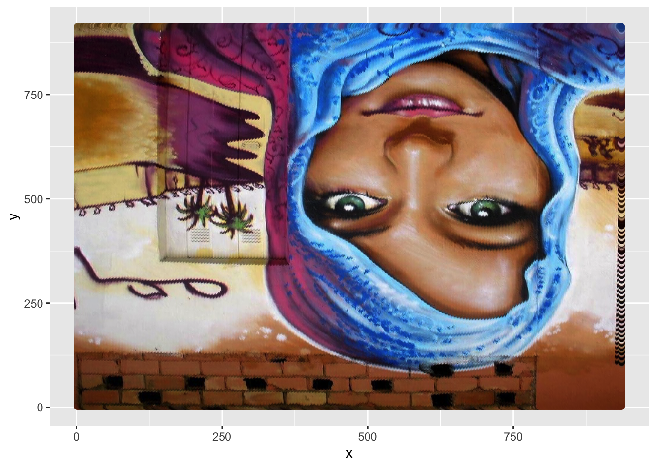
Using a few plotting options, we can remove the axes and orient the image properly:
ggplot(img_wide) +
  geom_point(mapping = aes(x = x, y = y, color = color)) +
  scale_color_identity() + # use the actual value in the `color` column
  scale_y_reverse() + # Orient the image properly (it's upside down!)
  theme_void() # Remove axes, background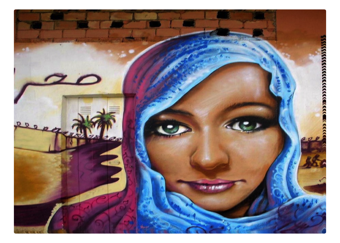
Random Sampling
Now, if we want to begin using randomness to create an abstract or artistic(?) representation of the image, we’ll have to sample only specific rows of the data:
# Take a sample of rows from the data frame
sample_size <- 2000
img_sample <- img_wide[sample(nrow(img_wide), sample_size), ]

# Plot only the sampled points
ggplot(img_sample) +
  geom_point(mapping = aes(x = x, y = y, color = color)) +
  scale_color_identity() + # use the actual value in the `color` column
  scale_y_reverse() + # Orient the image properly (it's upside down!)
  theme_void() # Remove axes, background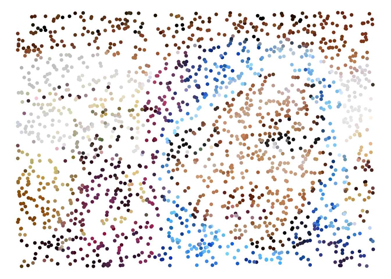
We can add another dimension of randomness by distorting the size using a randomly drawn value:
# Create random weights for point size
img_sample$size <- runif(sample_size)

# Plot only the sampled points
ggplot(img_sample) +
  geom_point(mapping = aes(x = x, y = y, color = color, size = size)) +
  guides(size = FALSE) + # don't show the legend
  scale_color_identity() + # use the actual value in the `color` column
  scale_y_reverse() + # Orient the image properly (it's upside down!)
  theme_void() # Remove axes, background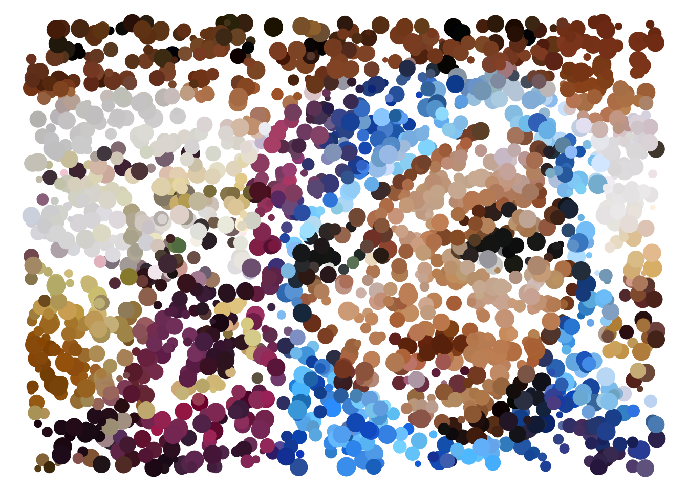
Alternatively, you could use an element of the data (such as the amount of Blue in each point) to determine the size:
# Use the amount of blue present in each point to determine the size
ggplot(img_sample) +
  geom_point(mapping = aes(x = x, y = y, color = color, size = Blue)) +
  guides(size = FALSE) + # don't show the legend
  scale_color_identity() + # use the actual value in the `color` column
  scale_y_reverse() + # Orient the image properly (it's upside down!)
  theme_void() # Remove axes, background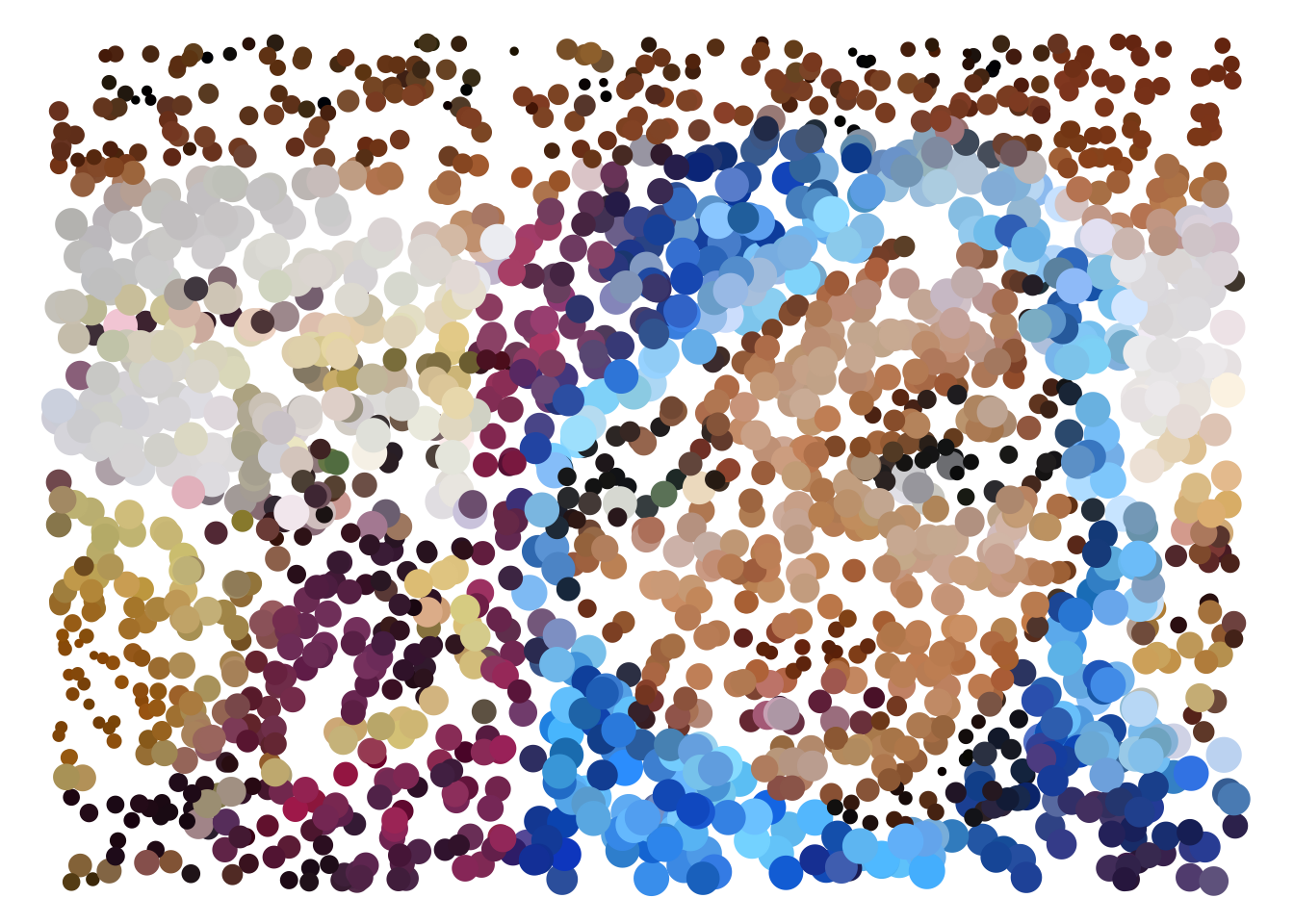
Voronoi Diagrams
A Voronoi Diagram is “a partitioning of a plane into regions based on distance to points in a specific subset of the plane” (Wikipedia). In other words, each area on the plane is determined by the nearest point. We can use this method (specifically, the ggvoronoi package) to represent the same image as a series of areas:
# Create a Voronoi Diagram of the sampled points
ggplot(img_sample) +
  geom_voronoi(mapping = aes(x = x, y = y, fill = color)) +
  scale_fill_identity() +
  scale_y_reverse() +
  theme_void()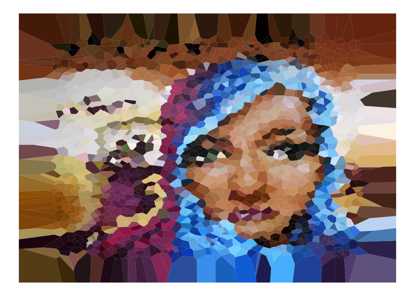
Edge detection
To amplify patterns at edges of objects in the image, we can use the cannyEdges function to detect edges in the image:
# Detect edges in the image
edges <- cannyEdges(img)
## Warning in cannyEdges(img): Running Canny detector on luminance channel# Display the edges
plot(edges)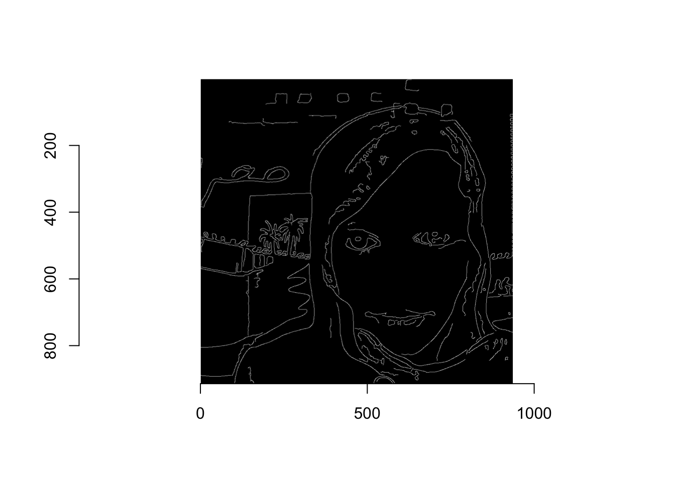
We can then again leverage a data frame representation of the image (in this case, the edges) to sample the image more heavily in these contrast areas. In order to do so, we’ll need to extract the data as a data frame and join it to our image data:
# Convert the edge image to a data frame for manipulation
edges_df <- edges %>%
  as.data.frame() %>%
  select(x, y) %>% # only select columns of interest
  distinct(x, y) %>% # remove duplicates
  mutate(edge = 1) # indicate that these observations represent an edge
Once we have this representation of the data, we can use it to weight the sampling of points in the image:
# Join on the edges data
img_wide <- img_wide %>%
  left_join(edges_df)

# Apply a low weight to the non-edge points
img_wide$edge[is.na(img_wide$edge)] <- .05

# Re-sample from the image, applying a higher probability to the edge points
img_edge_sample <- img_wide[sample(nrow(img_wide), sample_size, prob = img_wide$edge), ]
Using these re-sampled edges, we can create more intensified images:
# Re-create the voronoi diagram with the re-sampled data
ggplot(img_edge_sample) +
  geom_voronoi(mapping = aes(x = x, y = y, fill = color)) +
  scale_fill_identity() +
  guides(fill = FALSE) +
  scale_y_reverse() +
  theme_void() # Remove axes, background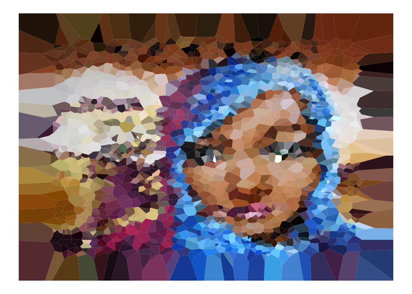
# Re-create the scatter plot with the re-sampled data (add random sizing of circles)
ggplot(img_edge_sample) +
  geom_point(mapping = aes(x = x, y = y, color = color, size = edge * runif(sample_size))) +
  guides(fill = FALSE, size= FALSE) +
  scale_color_identity() +
  scale_y_reverse() +
  theme_void() # Remove axes, background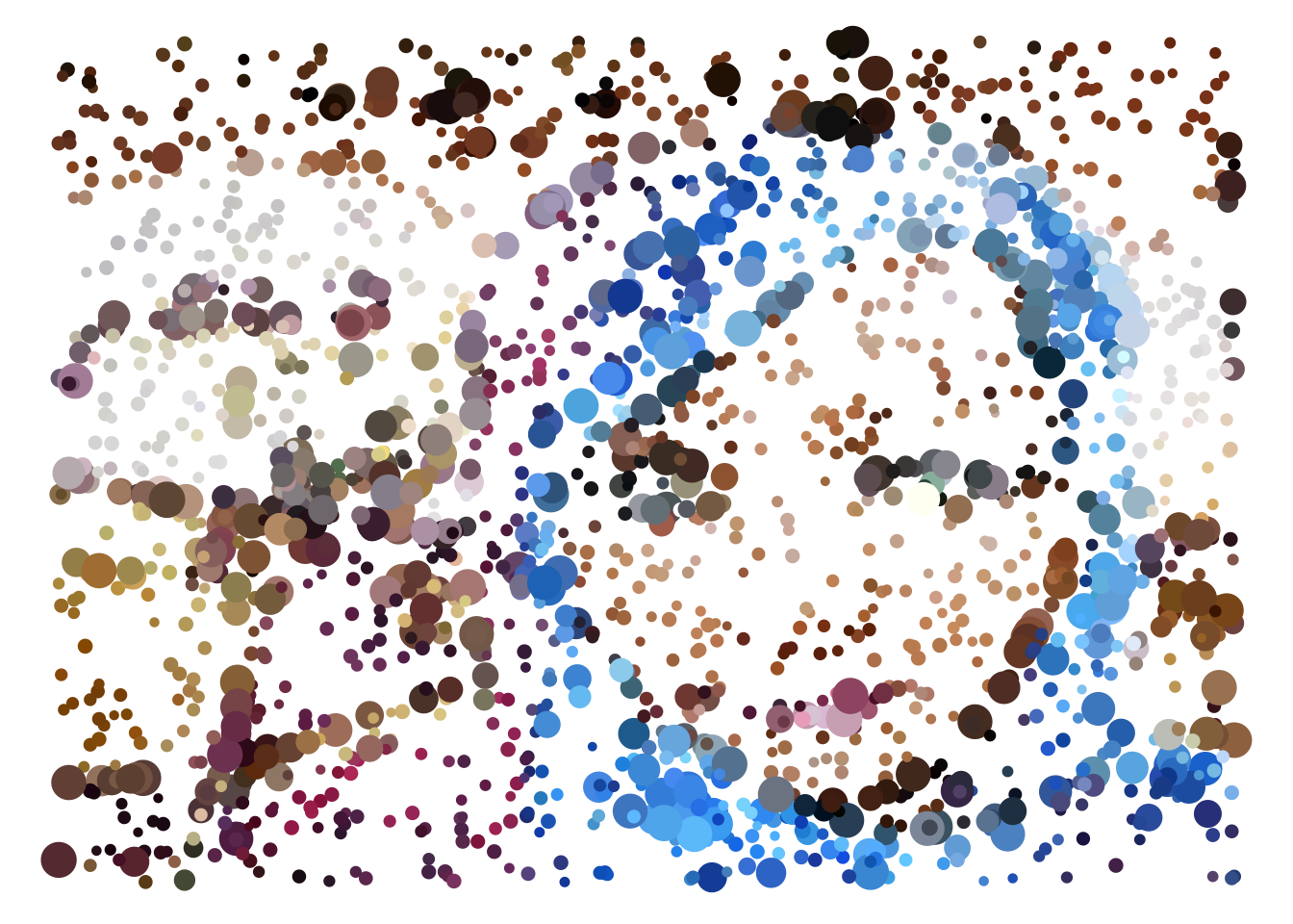
About
This explanation was built by Michael Freeman, a faculty member at the University of Washington Information School.
If you like this explanation (and are excited about learning R code) check out my new book, Programming Skills for Data Science.