I design and build visualization software to help people make sense of data.

I work at the intersection of design, engineering, and data science to expose meaningful patterns in data. I release software that facilitates data analysis, work collaboratively to create visualizations, and also teach these skills in University and professional environments. I'm drawn towards projects about social issues, and have an extensive background in public health.

Broadly, here's what I've been up to:

2010
2015
2021
2026

Software Engineering

I build software tools that let people interact with their data.

I have five years of experience making software that people use to summarize, transform, and explore their data. Some examples:

Duckplot

Summer.io

Open-sourced a chart building JavaScript package optimized for working with DuckDB Databases.

duckplot.com →
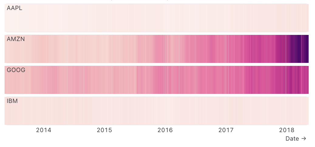
Duckplot chart example built on top of a DuckDB query

Data Table

Observable

Designed and built highly interactive visual summaries for displaying tabular data in analytics notebooks.

See it in the docs →
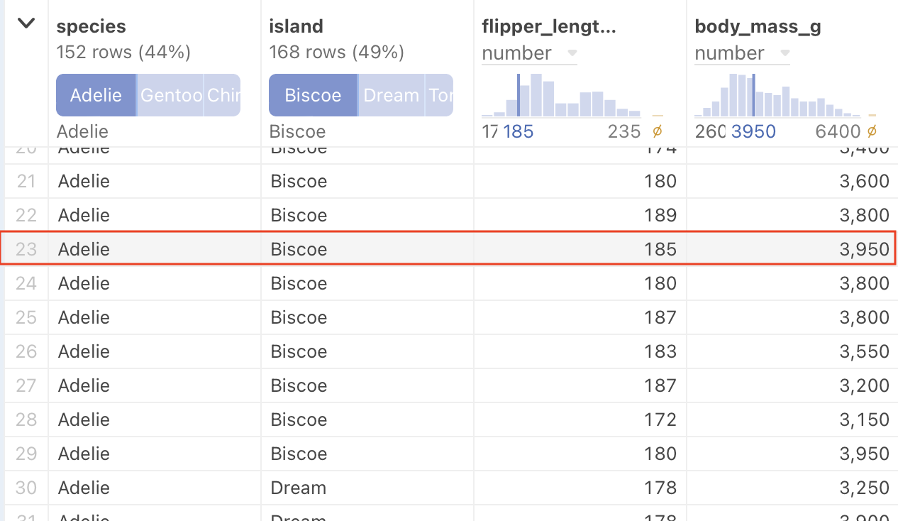
Observable Data Table cell showing column type, distribution, and a selected row

Data Visualization

I draw information to help answer questions.

In addition to building software that facilitates data exploration, I specialize in creating detailed and custom visualizations that reveal meaningful patterns in large datasets.

Financing Global Health

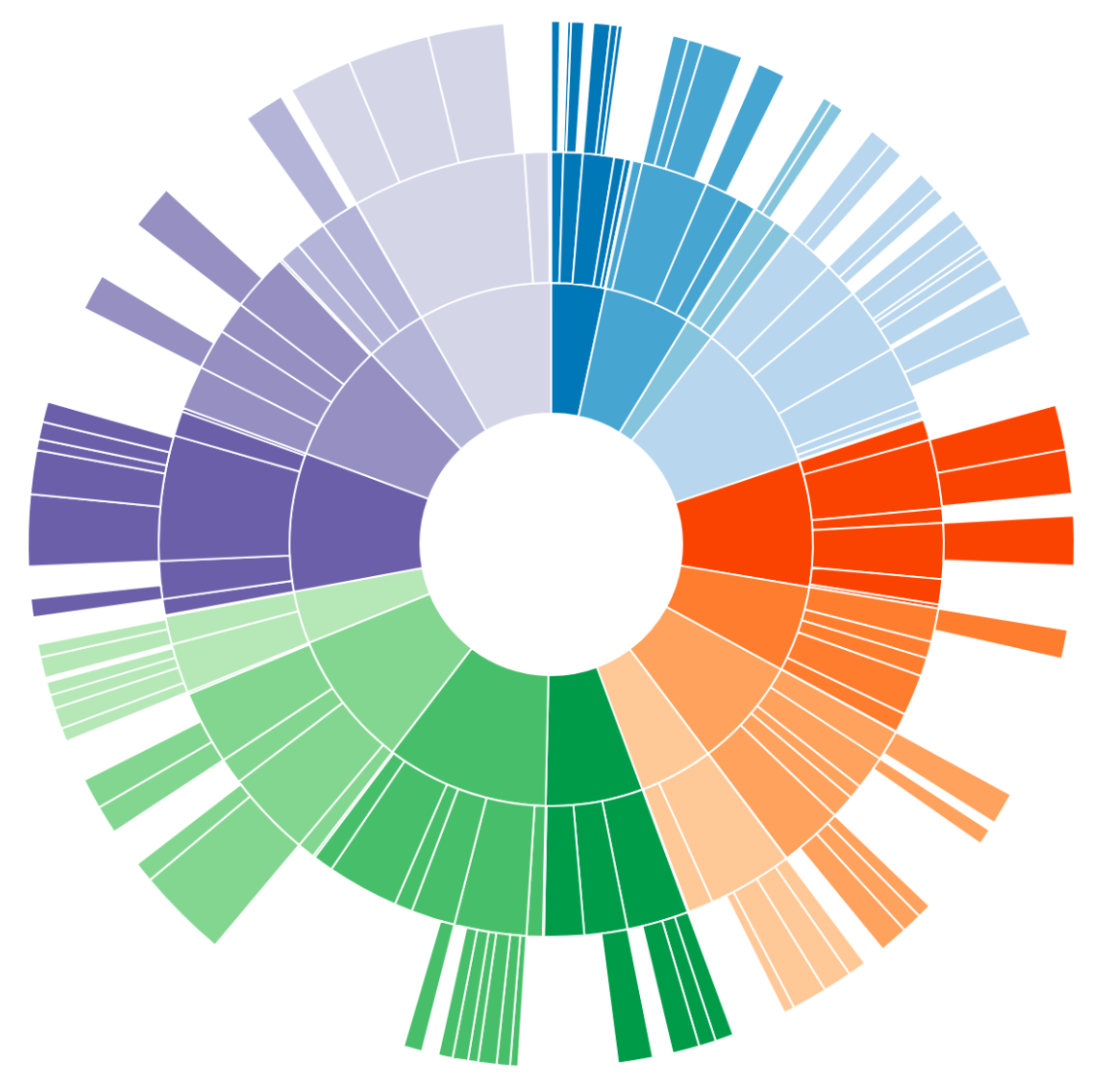
Tracing the flow of billions of dollars in Global Health, from sources, through intermediaries, to different causes.

Explore the interactive →

Discovering Date Patterns

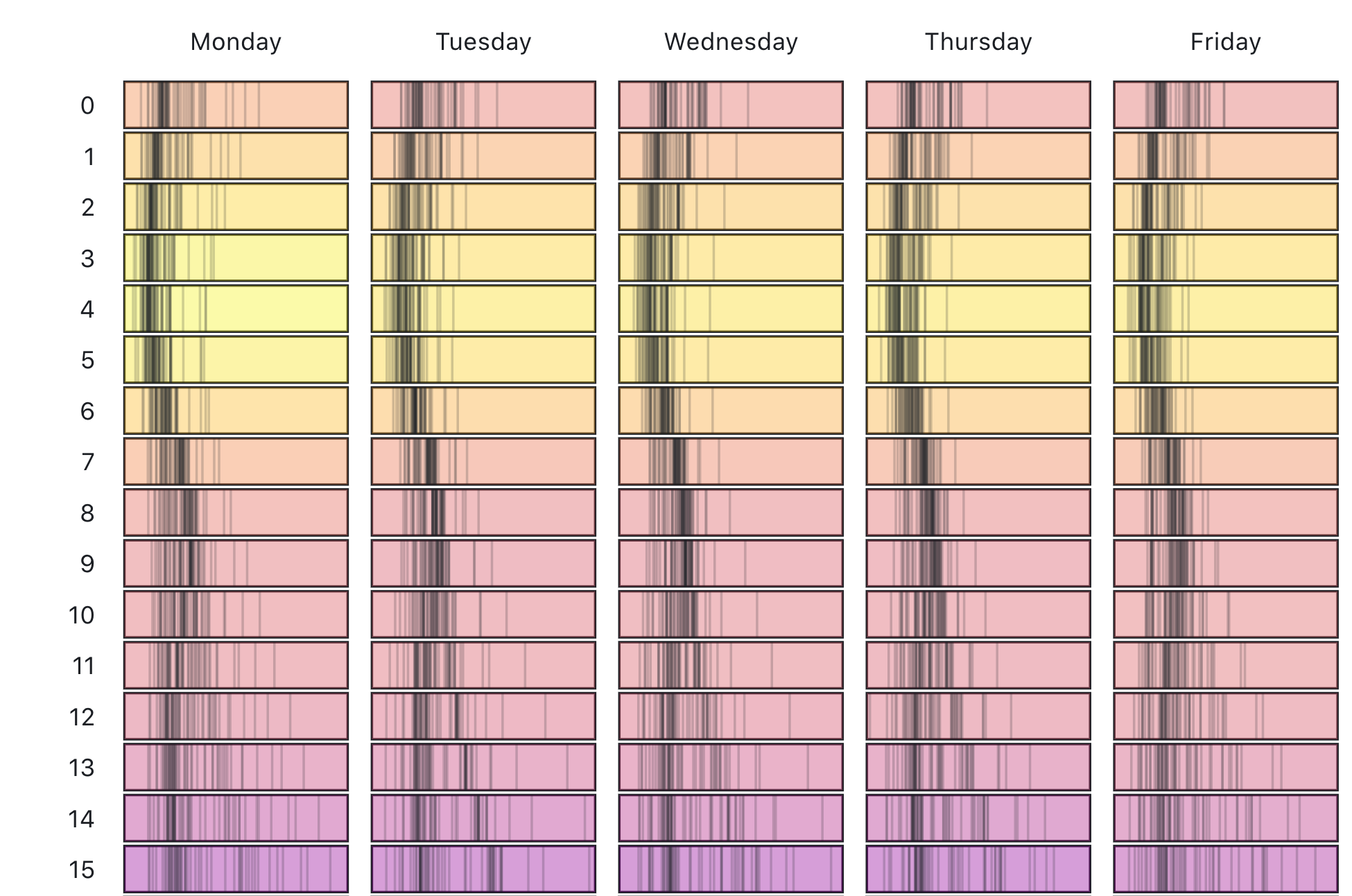
A series exploring a year's worth of hourly electricity demand data.

Open the notebook →
Diagram revealing patterns in a timeseries

More selected work

Visual Explanations

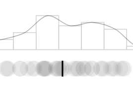
I use visualizations to explain difficult concepts.

I've built interactive explanations of statistical and machine learning concepts that have been used in my classroom and by hundreds of thousands of other people. See this talk for more details.

Teaching

I teach people how to work with data.

I spent six years as an Associate Teaching Professor at the University of Washington Information School where I taught Informatics students how to write code to work with data. I also received a Fulbright scholarship to teach in Madrid and collaborate on cancer research. I've taught dozens of workshops both at conferences and for private companies. Here are some of the resources I've built.

Published books/videos

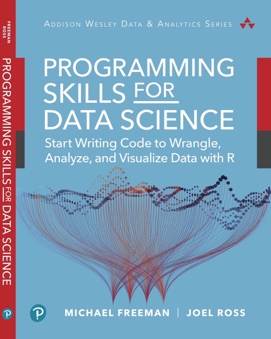
Programming Skills for Data Science

Teaches the foundational skills necessary for writing code to work with data (focused on the R programming language).

Programming Skills for Data Science book cover

Storytelling with Data Visualization

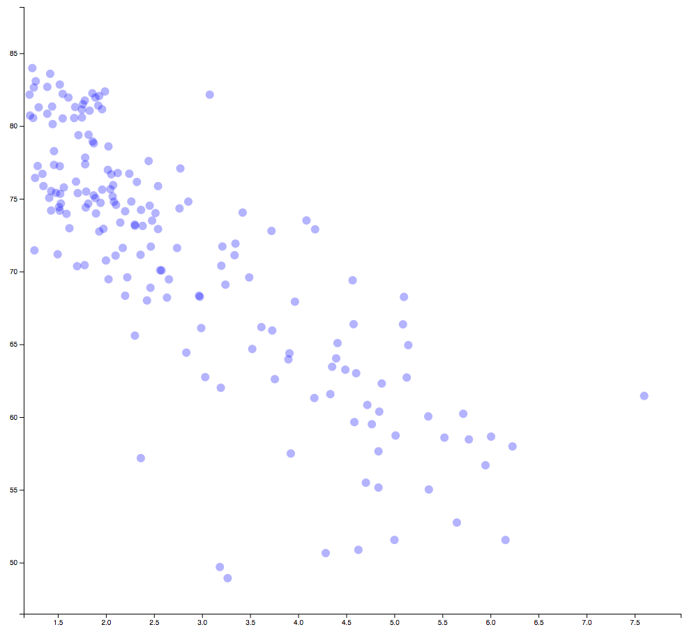
A video course teaching how to leverage a story's structure to share complex visualizations to a variety of audiences.

Scatter plot of blue points, from the Storytelling with Data Visualization course

Open-source curricula

Art

I (attempt to) make art.

While I prioritize interpretability in data visualization, I also enjoy exploring the purely aesthetic and creative side of software and data. Here are some things I've made that I think are beautiful.